
If you're searching for a Google Docs report template that can be reused every week or month, the challenge usually is not building the layout. The hard part is creating it once, then updating the data and narrative every time the report is needed.
With Slideform, you can create the report once in Google Docs, add placeholders, connect your data, and generate a polished report whenever the numbers change. Slideform works with dashboards, spreadsheets, CRMs, warehouses, and files, and you can use the Slideform Analyst to create narrative text, custom charts, and KPI callouts that fit the same report.
Quick answer: To create a reusable Google Docs report in Slideform, build the document layout, add placeholders for dynamic content, connect your data sources, map each placeholder to the right content, and generate a fresh finished version whenever you need it.
What is a Google Docs report template?
A Google Docs report template is a reusable document layout for recurring reporting. Instead of starting from a blank page every time, you keep the structure, headings, fonts, and branded sections fixed, then refresh and update the content when the data change.
For example, a monthly marketing report in Google Docs might always include:
- An executive summary
- A KPI snapshot
- Charts for traffic, leads, revenue, or pipeline
- A short analysis of what changed
- Recommended next steps
That makes Google Docs a good format when your audience wants a narrative report rather than a deck. If your team also needs presentation output, see how to automate recurring presentations or how to turn an existing deck into a reusable template.
Why use Slideform for a Google Docs report template?
Most teams can build the layout itself. The repetitive work happens later: updating KPIs by hand, capturing charts, rewriting commentary, and saving a new file for each client or business unit.
Slideform fixes that workflow by connecting your template to live data and reusable reporting logic. That means you can:
- Use your own branded Google Docs layout instead of a generic report builder
- Pull visuals and metrics from connected data sources
- Combine dashboard data with supporting inputs from Google Sheets or Google Drive
- Create saved analysis blocks with the Analyst so your narrative updates with the data
- Generate recurring reports on demand or on a schedule, similar to the workflow shown in Auto-generate Slides and PowerPoint Reports on a Schedule
- Use Bulk Mode to create many reports at once for each client, account, region, or business line from different rows in a sheet or different filter values in a dashboard
How to create a reusable recurring report in Google Docs
1. Build the report layout in Google Docs
Start with the document your reader actually wants to receive. In Google Docs, create the headings, tables, section labels, and narrative blocks you expect to reuse. Think about the report as a shell that will be filled in later.
A simple structure could include:
- Title page or header with client name and reporting period
- Executive summary section
- KPI block for revenue, sessions, leads, or pipeline
- Two to four charts or tables
- A recommendation or action-items section
The more stable the structure is, the more valuable the template becomes. This is especially useful for agencies, RevOps teams, and customer-facing teams that produce the same type of report over and over. For related workflows, Slideform also supports broader enterprise reporting and marketing agency reporting.
2. Add placeholders for the content that will change
Once the layout is in place, replace the variable content with placeholders. These placeholders tell Slideform where the data should go when the report is generated.
Typical placeholders in a Google Docs report template might look like:
{{client_name}}{{reporting_period}}{{total_sessions}}{{chart:traffic_by_channel}}{{executive_summary}}
Text and KPI placeholders can sit inline within a paragraph. Chart placeholders usually live inside a box or section where the visual should appear.
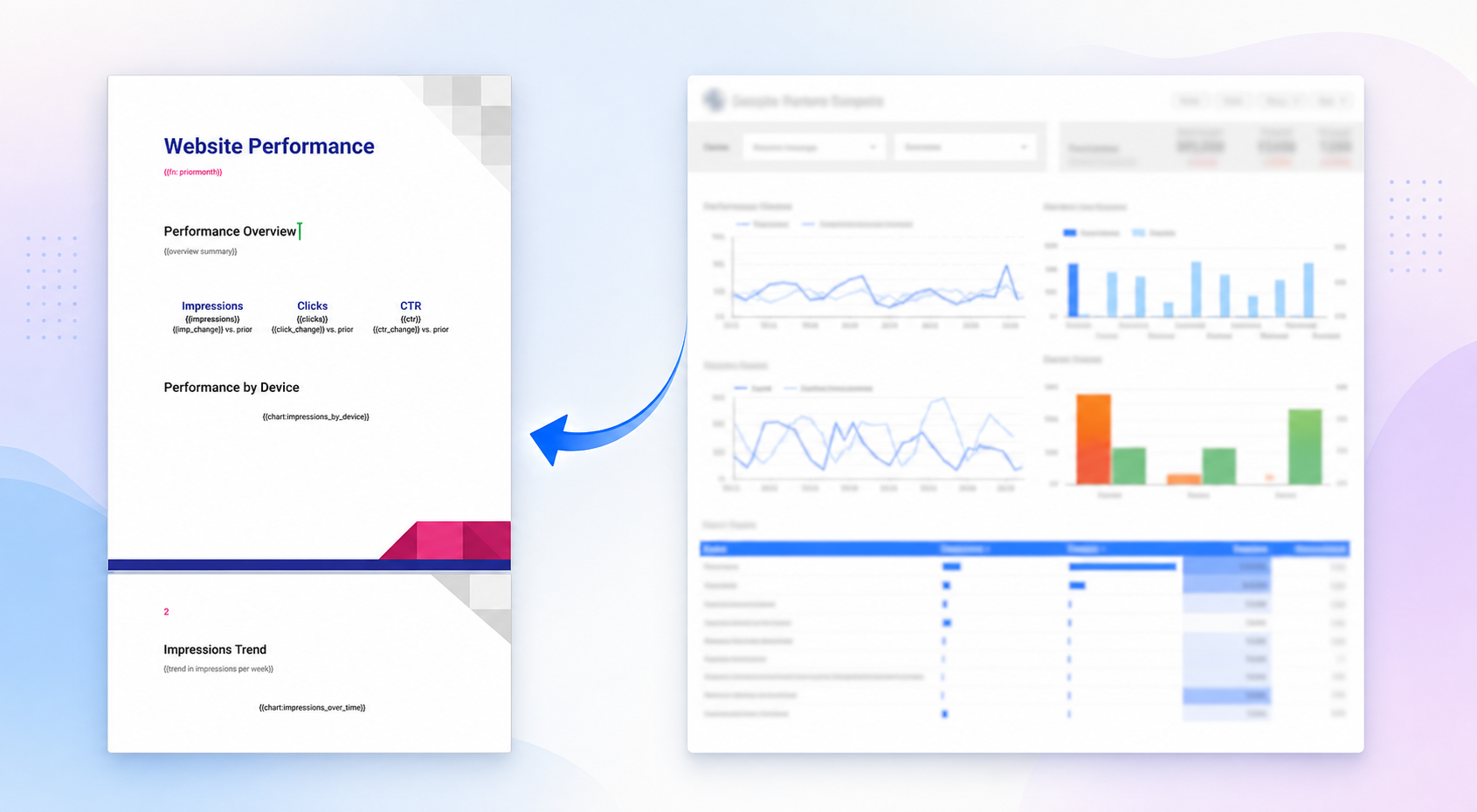
As a rule of thumb, keep placeholder names descriptive. A clear name like {{pipeline_by_region}} is easier to configure and maintain than something vague like {{chart1}}.
3. Connect your data sources to Slideform
Next, connect the data source. Slideform can work from dashboards, spreadsheets, CRM data, warehouses, and files, depending on how your reporting workflow is set up.
For this walkthrough, imagine the recurring report is powered by a Looker Studio dashboard, but the same setup works across the broader Slideform integrations. This is the step that turns a static Google Doc into a reusable reporting system.
If your workflow also depends on spreadsheet data, approval notes, or brand assets, you can layer in other sources from Google Sheets and Google Drive too.
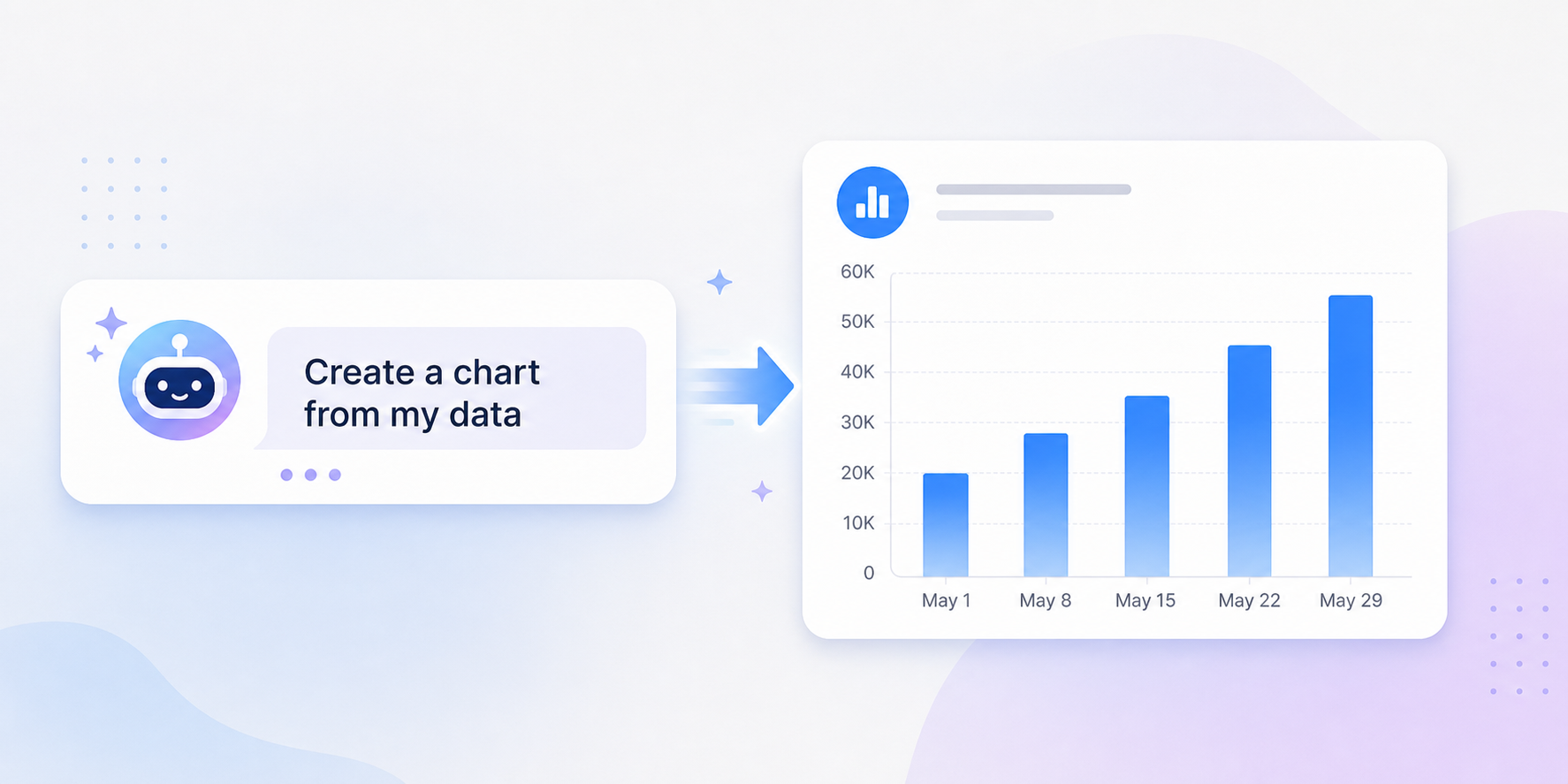
4. Use Slideform Analyst to create summaries and visualizations
Ask the Slideform Analyst to create report-ready elements from a natural language prompt. This is useful when the source data is right, but the existing chart or written summary is not in the format you want for the final document.
For example, you can prompt the Analyst to:
- Create a cleaner client-ready chart from the underlying data
- Write an executive summary explaining the biggest changes in the latest period
- Compare performance to the previous month or quarter
- Generate bullet points for wins, risks, and next steps
Those outputs can be saved and reused just like any other report component. That means the summary or visualization updates when the data updates, instead of forcing your team to rewrite the report each cycle.
5. Map each placeholder to the right data, chart, or analysis
After the template, data sources, and any Analyst outputs are ready, map each placeholder to the content that should fill it.
This is where Slideform becomes more than a screenshot tool. You can map a placeholder to:
- An existing chart from a connected dashboard
- A KPI or metric extracted from a connected data source
- A table or supporting data range
- A saved AI-generated narrative, insight block, or visualization
For example, you might map {{chart:traffic_by_channel}} to a bar chart from Looker Studio, {{total_sessions}} to a scorecard value, and {{executive_summary}} to a saved Analyst workflow that explains the biggest month-over-month changes.
6. Generate the report and save it back to Drive
Once everything is mapped, generate the report. Slideform fills the Google Docs report template with the current data and outputs a finished document that your team can review, edit, and share.

That final step matters. The point is not just automation. It is automation into an editable file your team already knows how to work with.
At this stage you can:
- Review the generated report before sending it
- Save it to a shared Drive destination
- Create a fresh report for each client, region, or business unit
- Repeat the same workflow on a schedule
If you prefer a slide-based deliverable for some audiences and a document for others, the same reporting logic can often be reused across formats. That is one reason Slideform's dashboard-to-output workflow is useful beyond a single template.
Example outline for a Google Docs monthly report
If you are building your first recurring report in Google Docs, this structure works well:
- Title block: client name, report name, reporting period
- Executive summary: one short paragraph on what changed
- KPI snapshot: three to six core metrics
- Channel or segment performance: one to two charts with short captions
- Wins and risks: bullet points generated from the latest data
- Next steps: recommendations or action items
This format is readable, executive-friendly, and well suited to both internal reporting and client-facing updates.
Common questions about Google Docs report templates
Can a Google Docs report pull in charts from a dashboard?
Yes. With Slideform, the template stays in Google Docs while the data and visuals come from your connected sources. That can include dashboards such as Looker Studio, along with spreadsheets and other business systems.
Is Google Docs or Google Slides better for recurring reports?
Google Docs is better when the report needs more written explanation, longer takeaways, or narrative structure. Google Slides is better when the report is meant to be presented live. Many teams need both. If you want the presentation version too, see this guide to automating recurring presentations.
Can I reuse one Google Docs report template across multiple clients or teams?
Yes. That is one of the main benefits of templated reporting. Keep the layout fixed, then change the data inputs, filters, and placeholders for each client, account, region, or business line.
Can I mix dashboard data with spreadsheet or file-based content?
Yes. Slideform can combine dashboard content with data from Google Sheets, assets from Google Drive, and other connected systems. That is helpful when part of the report lives in BI and part lives in operational spreadsheets.
Next step
If you need a Google Docs report template that does more than look good on day one, build it so the data can refill it automatically. That is the real unlock: the same template can support weekly, monthly, and quarterly reporting without rebuilding the report every cycle.
To explore the setup in more detail, start with the integrations page, learn how the Analyst creates report-ready narrative, or book a demo to see a Google Docs reporting workflow end to end.