Automate GitHub Reporting with Slideform
Engineering teams rely on GitHub every day—but reporting on GitHub activity is still surprisingly manual. Metrics live across multiple dashboards and reports often require copying metrics into PowerPoint or Google Slides.
The GitHub Connector for Slideform eliminates that work. Slideform connects directly to GitHub, calculates key engineering metrics, and automatically delivers them into recurring presentations or email reports—no manual updates required.
This post explains how GitHub reporting works in Slideform, how it compares to other engineering analytics tools, and how to get started.
What is Slideform?
Slideform is an automation platform for business analytics. You upload a PowerPoint or Google Slides template, connect your data sources, and Slideform fills in charts, metrics, and AI-generated summaries on a schedule.
It’s designed for teams that produce the same reports every week or month and want them generated automatically.
Automated GitHub Analytics
GitHub contains valuable signals about engineering performance, but raw activity isn’t reporting-ready. Slideform transforms that data into structured metrics that are easy to understand and share.
Built-in metrics include:
-
Pull request volume and merge rate
-
Time to first review
-
Review and merge cycle time
-
Commit frequency and contributor activity
-
Issue throughput and resolution time
-
Repo- and team-level comparisons
All metrics are time-bounded, normalized, and formatted for leadership reporting.
Generate Slides and Reports
Once connected, GitHub becomes a live data source inside Slideform. You can automatically generate:
-
Weekly or monthly engineering decks
-
Sprint and delivery review presentations
-
Leadership updates
-
Weekly engineering summary emails
Slideform regenerates slides and emails on a schedule so every chart and summary reflects the latest GitHub data—no copy-paste, no screenshots.
Slideform connects to dozens of data sources in addition to Github. See the complete list at: Data Integrations
AI-Powered GitHub Reporting
Slideform’s GitHub reporting agent automates the full workflow:
-
Data collection – pulls metrics directly from GitHub
-
Analysis – calculates trends, comparisons, and aggregates
-
Visualization – generates charts and tables
-
Formatting – inserts results into your templates
-
Delivery – runs on a schedule at scale
All reports use your existing slide templates, so branding stays consistent.
How Slideform Compares to Engineering Analytics Tools
There are strong third-party tools for engineering analytics, including:
-
Appfire Flow – dashboards for PR cycle time, commits, and team performance
-
LinearB – workflow efficiency metrics and delivery insights
-
Graphite Insights – PR-focused metrics like publish-to-merge time
These tools are optimized for engineering metrics. Slideform solves a different problem: getting the metrics into presentations, reports, and emails.
| Capability | Third-Party Analytics Tools | Slideform GitHub Analytics Connector |
|---|---|---|
| GitHub workflow metrics | ✅ | ✅ |
| Interactive dashboards | ✅ | ❌ |
| Engineering coaching & alerts | ✅ | ❌ |
| Automated slide generation | ❌ | ✅ |
| Recurring executive decks | ❌ | ✅ |
| Automated email reports | ❌ | ✅ |
| Cross-team reporting (Sales, CS, Marketing, Engineering) | ❌ | ✅ |
Secure by Design
The GitHub Connector follows Slideform’s security standards:
-
Read-only GitHub access
-
Least-privilege permissions
-
Secure credential handling
-
SOC 2–aligned architecture
Data is used only for reporting you configure. Additional privacy and security information can be found in the Slideform Trust Center.
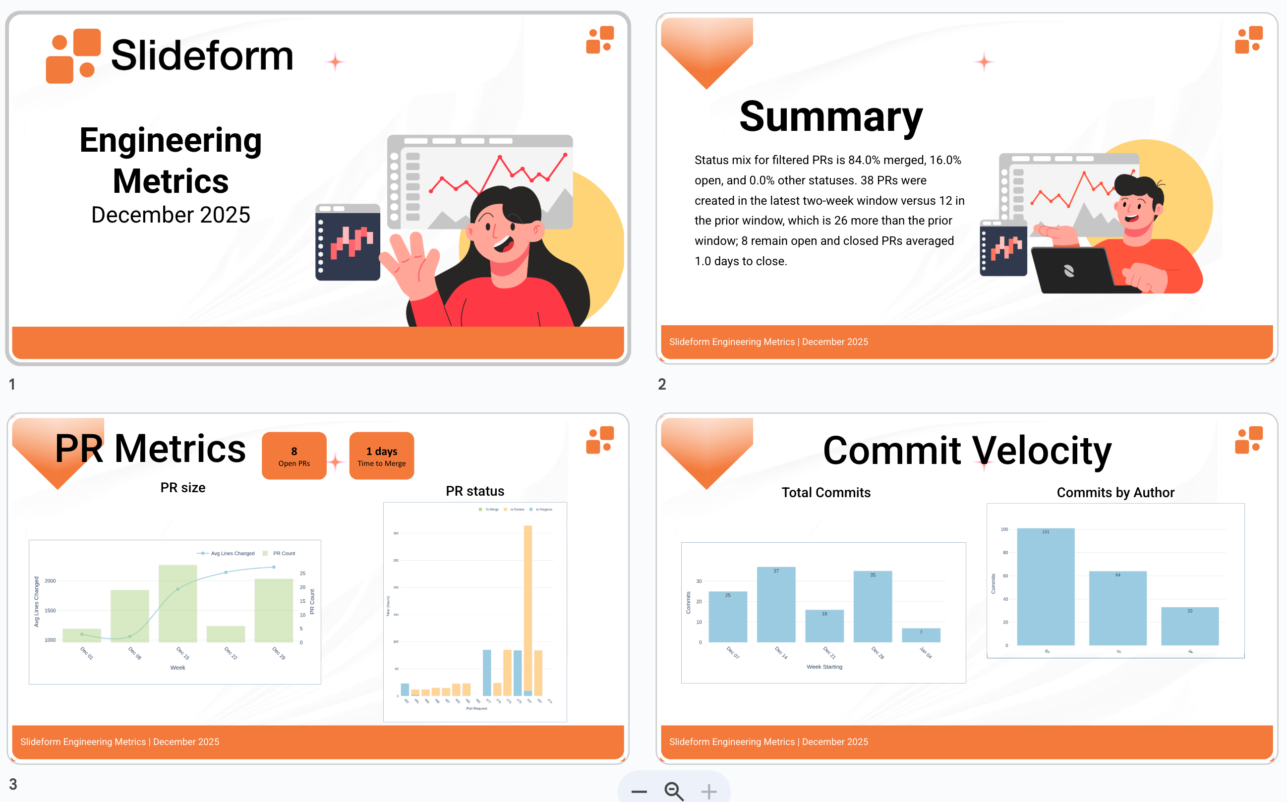
Example Report
Monthly Engineering Team Review: Deliver a scheduled internal report showing pull request activity and commit velocity signals for engineering leadership.
Slide template: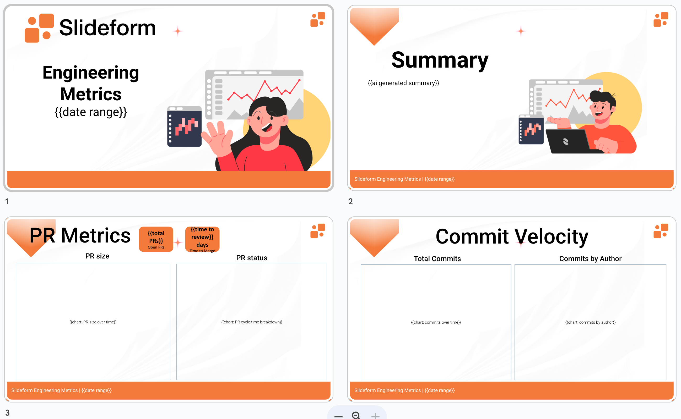
Slideform can generate summaries and metrics using natural language prompts.
- Prompt:
"Summarize the pull request activity over the past month. Write the answer in a couple of sentences. Analyze the number of pull requests created in the past 2 weeks and compare it to the previous 2 weeks. How many of these PRs are still open? Looking at the merge dates for the closed PRs, calculate the average amount of time to close. " - Response:
"Status mix for filtered PRs is 84.0% merged, 16.0% open, and 0.0% other statuses. 38 PRs were created in the latest two-week window versus 12 in the prior window, which is 26 more than the prior window; 8 remain open and closed PRs averaged 1.0 days to close."
A variety of standard engineering metrics and charts are automatically produced by Slideform and are available for embedding into reports.
Slide output:
Many other use case examples can be found on the Slideform Blog.
Getting Started
-
Connect GitHub
Authorize access via OAuth and select repositories. -
Create a Template
Use an existing PowerPoint or Google Slides deck and add placeholders. -
Map Metrics
Assign GitHub metrics or AI-generated insights to each placeholder. -
Schedule Delivery
Run reports on demand or on a schedule. Deliver via email, Slack, or shared drives.
GitHub Reporting, Fully Automated
The GitHub Analytics Connector brings engineering metrics into the same automated reporting workflows teams already use for sales, marketing, and customer success.
No more spreadsheets.
No more screenshots.
No more last-minute report assembly.
With Slideform, GitHub analytics become living reports—generated automatically, delivered consistently, and ready to share.
To see the GitHub Analytics Connector in action, connect GitHub to Slideform and start generating automated engineering reports in minutes.